 GambleLore
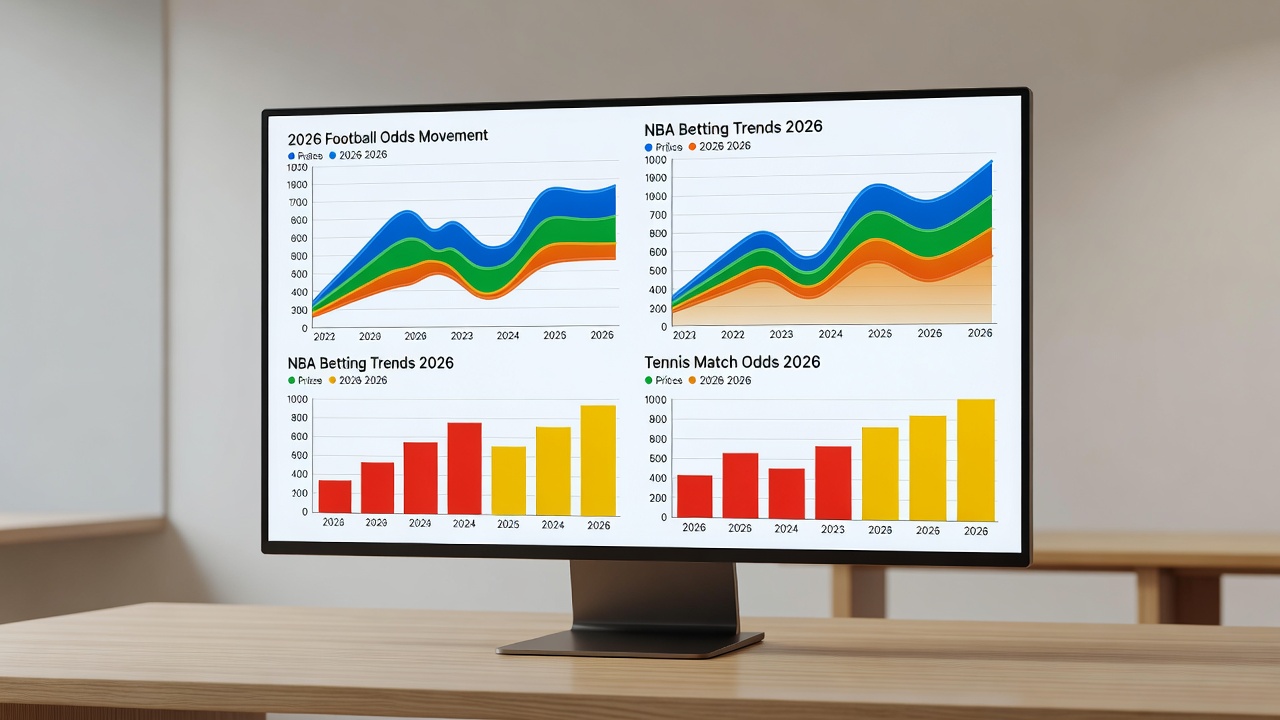
Introduction to Visualizing Betting Odds in 2026
Understanding sports betting odds requires more than scanning numbers on a screen. In 2026, data visualization turns raw odds movements into clear patterns that intermediate bettors can act on quickly. This guide covers practical tools and methods for football, NBA, and tennis, helping you spot value without deep statistical knowledge. Bettors who master visual analysis often gain an edge by identifying trends that others overlook in fast-moving markets.
The shift toward visual tools reflects broader changes in how sports data is consumed. Instead of relying solely on spreadsheets or static lists, modern bettors leverage interactive charts that update in real time. This approach simplifies complex datasets from multiple bookmakers and leagues, making it easier to compare opening lines against closing odds across hundreds of events each week.
Why Visualization Beats Raw Data for Odds Analysis
Raw odds lists can overwhelm even experienced bettors. Charts reveal trends like line movements or sharp action that numbers alone hide. Visual tools highlight discrepancies across bookmakers faster, improving decision speed during live markets. For instance, a sudden spike in a football total line becomes immediately obvious on a line graph, whereas scanning rows of numbers might take minutes.
Visualization also reduces cognitive load. When tracking NBA player props or tennis set betting, color-coded heat maps allow quick identification of value bets. This method supports better risk management by showing historical volatility at a glance, helping bettors avoid chasing lines that have already moved too far.
Recommended Free and Paid Visualization Tools
Several accessible platforms suit betting analysis. Free options include Google Sheets with built-in charts and Microsoft Power BI's starter edition. Paid tools like Tableau Public or advanced Power BI offer deeper customization for tracking multiple sports simultaneously. Google Sheets remains popular because it integrates easily with public data sources and requires no upfront cost.
Tableau provides robust filtering options ideal for comparing football leagues and NBA conferences side by side. Power BI excels at live connections to odds feeds, allowing dashboards to refresh automatically. Beginners should test free tiers first before committing to subscriptions, as many features in paid versions overlap with what spreadsheets already offer for basic line tracking.
Step-by-Step Setup for Tracking Odds Movement
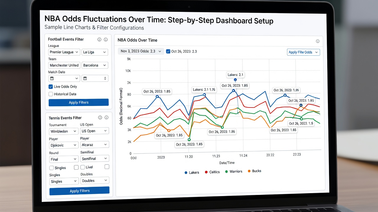
Begin by collecting odds data from reliable sources into a spreadsheet. Import timestamps and opening versus closing lines. Create line charts to plot movement over time, then add filters for specific matches in football or NBA games. For tennis, focus on set-by-set odds shifts and use color coding to flag significant drops that may indicate informed betting.
Next, organize columns for sport, league, team or player, bookmaker, and time stamps. Build separate worksheets for each sport to avoid clutter. Once data is structured, insert line charts with time on the x-axis and odds values on the y-axis. Add conditional formatting to highlight movements exceeding a chosen threshold, such as a 10 percent shift within an hour.
Real-World Examples from Recent Matches
Consider a Premier League football fixture where visualization showed a rapid shift in the over/under line after team news. The chart highlighted a 15 percent movement within an hour, signaling potential value on the under. Similar patterns appeared in an NBA game where a dashboard tracked player prop odds across books, revealing consistent underpricing on a star's assists line that raw tables obscured.
In tennis, live set betting provides clear examples. During a Grand Slam match, bar graphs illustrated momentum swings after a break of serve, allowing bettors to enter positions at favorable odds before the market adjusted. These cases demonstrate how visual cues help intermediate users act decisively rather than second-guessing raw figures.
Comparing Visual Insights Versus Raw Data
Raw data requires manual scanning for anomalies. Visual dashboards surface outliers instantly through color and shape. Bettors report faster identification of mispriced odds when using graphs rather than spreadsheets alone. Over multiple seasons, this speed advantage compounds into more consistent long-term results.
Another advantage lies in pattern recognition across sports. A single dashboard can overlay football totals trends with NBA totals trends, revealing correlations that isolated data points miss. This cross-sport view supports diversified betting strategies without overwhelming the user with separate spreadsheets.
Actionable Tips for Building Simple Dashboards
- Connect data feeds from major sports sites for live updates.
- Use consistent color schemes across football, NBA, and tennis views.
- Add alerts for threshold breaches in odds movement.
- Test dashboards on historical data before applying to live betting.
- Include comparison columns that calculate implied probabilities from odds values.
- Group related metrics such as moneyline and totals on the same tab for quick reference.
Link key sources such as UEFA for football schedules and NBA official site for game data. Tennis insights benefit from ATP Tour resources, while broader international context comes from FIFA match calendars.
Common Mistakes to Avoid
Overloading dashboards with too many metrics reduces clarity. Always verify data sources to prevent errors in odds tracking. Beginners should start small with one sport before expanding. Ignoring time zones when importing live data can also distort movement timelines, leading to missed opportunities.
How Visualization Applies to Specific Sports
Football analysis benefits most from totals and handicap line charts because these markets move frequently on team news. NBA dashboards often emphasize player props with scatter plots showing correlation between minutes played and performance metrics. Tennis requires granular set-level tracking, where momentum indicators on line graphs help predict in-play value before the next game begins.
Building a Simple Dashboard: Practical Walkthrough
Start in Google Sheets by creating a new file and labeling columns for date, sport, event, bookmaker, opening odds, current odds, and movement percentage. Paste sample data from three recent matches in each sport. Insert a line chart for one football fixture and duplicate the sheet for NBA and tennis. Add a summary tab with average movement values calculated by simple formulas. This basic structure scales easily when more data sources are added later.
FAQ
Are visualization tools accurate for betting odds?
Accuracy depends on the quality of imported data. Tools themselves simply display what you provide, so cross-check with official league sites.
Can beginners use these tools effectively?
Yes. Start with free spreadsheet options and follow guided templates before moving to advanced platforms.
How often should dashboards be updated?
Update at least hourly during active betting periods for the most relevant insights.
Do free tools provide enough features for serious analysis?
Free tiers handle most intermediate needs, including basic charts and filters, though paid upgrades add automation and larger data limits.
Conclusion
Data visualization empowers 2026 bettors to interpret odds across football, NBA, and tennis with greater speed and clarity. By combining the right tools with structured setups, you gain a practical edge in pattern recognition that raw numbers cannot match. Consistent practice with these methods turns visual analysis into a reliable component of any betting routine.

No comments yet. Be the first!